

Overview
This project's primary objective is to improve customers' shopping experience by implementing a feature that allows them to create and manage multiple shopping lists within the smart cart UI. This feature aims to streamline the shopping process, enhance organization, and cater to different shopping purposes and preferences.
This project's primary objective is to improve customers' shopping experience by implementing a feature that allows them to create and manage multiple shopping lists within the smart cart UI. This feature aims to streamline the shopping process, enhance organization, and cater to different shopping purposes and preferences.
Approach
Timeline: 9 weeks
I strategically phased my UX initiative into three key stages, leveraging a systematic approach to enhance organization and foster an intuitively cohesive user experience:
- Research
- Ideation
- Design
Goals
- Enhance Shopping Efficiency: Streamline the grocery shopping process by allowing users to create and manage multiple purpose-driven shopping lists
- Improve Personalization: Provide users with personalized suggestions
- Increase User Satisfaction: Offer a seamless, intuitive smart cart interface that improves the overall shopping experience
Problem Statement
How might we enhance the smart cart experience to help users create and manage multiple shopping lists, streamline their grocery trips, and make the process more efficient and personalized?

Considerations
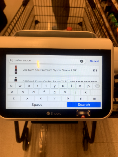
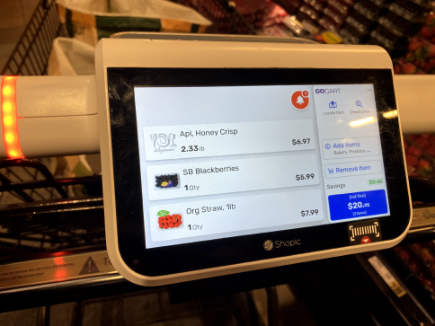
There are around 50,000-70,000 items on average in a grocery store. The need for categories to provide some form of organization is going to be essential for this project. Currently, there isn’t much of a classification for the system at the moment and s that will be a big task to take on.
- 72% of people spend less than 42 hours in the store
- On average, people shop for groceries 8 times a month
- 66% of shoppers use a cart when shopping
- 59% of shoppers shop on Friday, Saturday, or Sunday
- In what order do you want to shop for certain items? Heavy items to light. Fresh produce to frozen items. Bigger to smaller. Cheapest to most expensive.
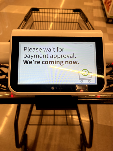
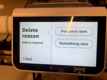
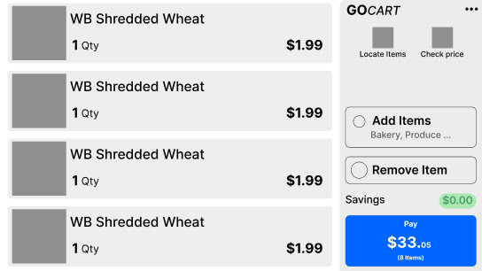
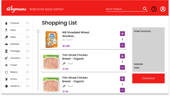
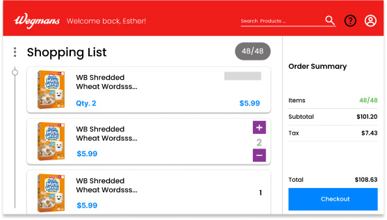
Heuristics Evaluation
I performed a heuristics evaluation based on a grading scale (A,B,C,D,F). Overall, the current design lands at a "D". As of right now, this experience is more of a novelty, and although it's a great idea, it's just not there yet. Here are some areas for improvement:
- Simpler Onboarding Process
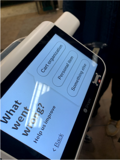
- Advanced help and feedback options
- Consistent UI and button treatment
- Advanced Filtering Options
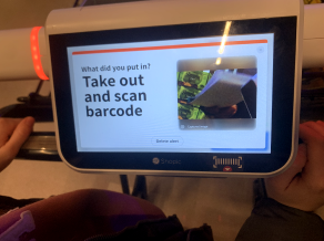
- Vague Instructions, especially at checkout
- Advanced help and feedback options
- Consistent UI and button treatment
- Advanced Filtering Options
- Vague Instructions, especially at checkout

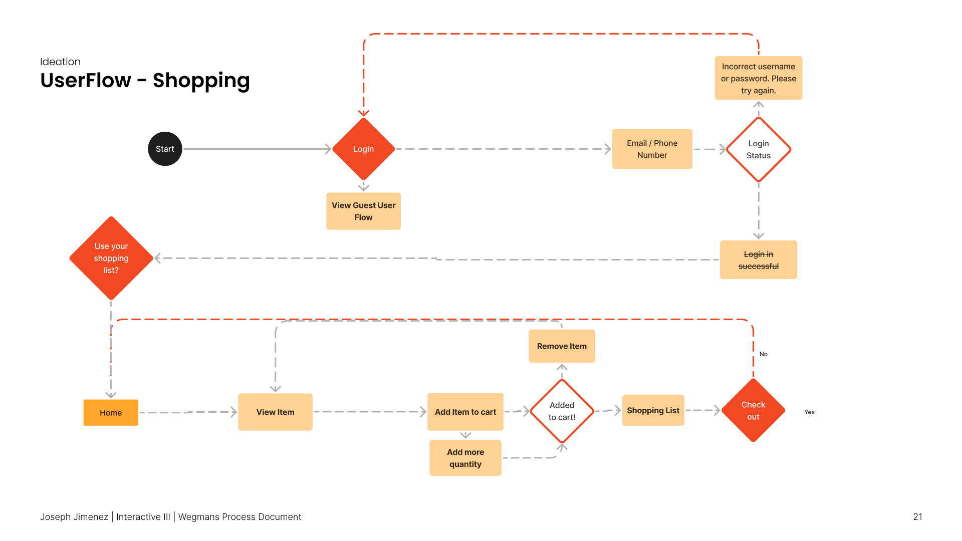
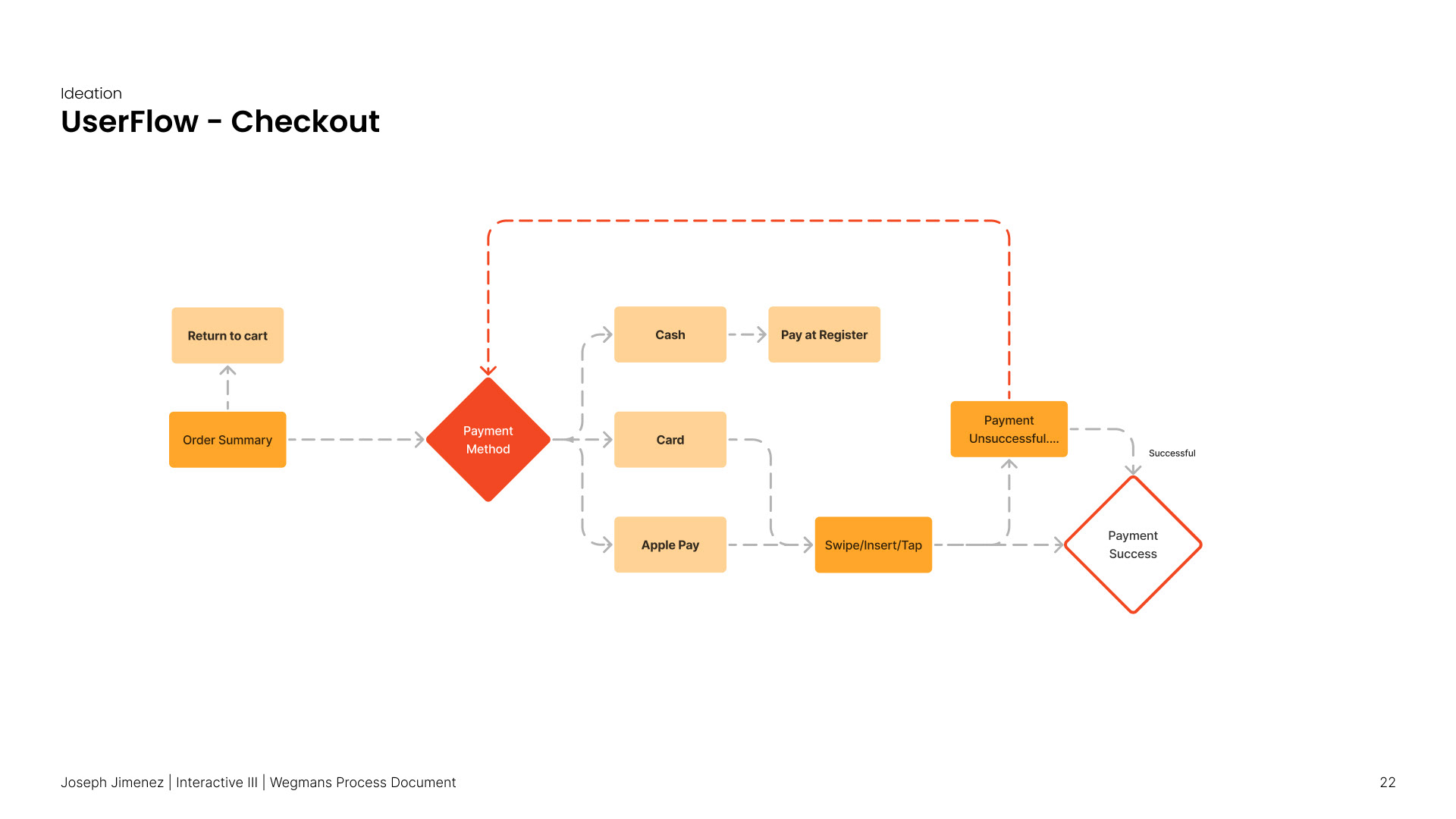
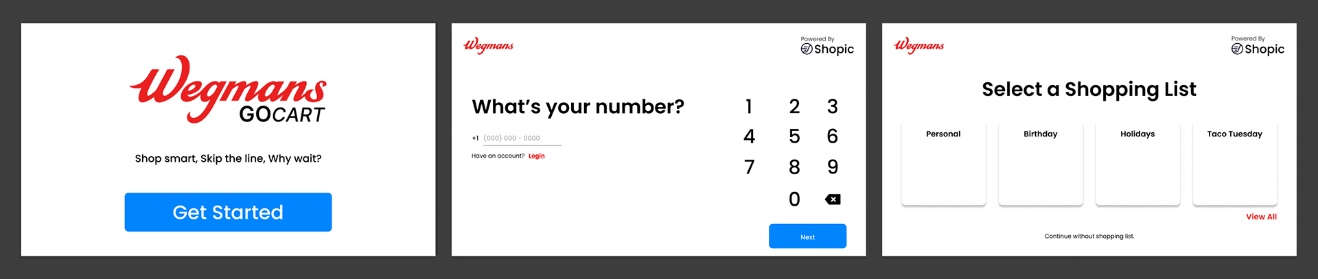
User Flows
Wireframes

Branding
Final Screens

Final Demo Reel
Takeaways
This project was the first time I prioritized functionality and usability over simple visuals. That being said, it was a challenge trying to solve for one user flow instead of just trying to redesign the entire experience.
The list itself was a challenge, as I tried to figure out how I would be able to filter item options for each list, whether or not the user could switch between different lists as well, or even combine separate shopping lists if they had to shop for more than one purpose.
Overall, I learned how to take an existing product in the market take pain points that exist, and work to improve upon them. I didn't have a lot of grocery store knowledge before this project, but you best believe I know my way around the overall shopping experience now!

