
Project Goals
Revamp the city website for enhanced user experience, highlighting the beauty of the city and the exciting life it has to offer while keeping the formality of a government website.
Targeting young adults and college students, particularly considering Rochester's significant college demographic, the goal is to provide a platform for exploration. By offering insights into the city's offerings, the aim is to enhance students' experience and potentially contribute to increased retention rates.
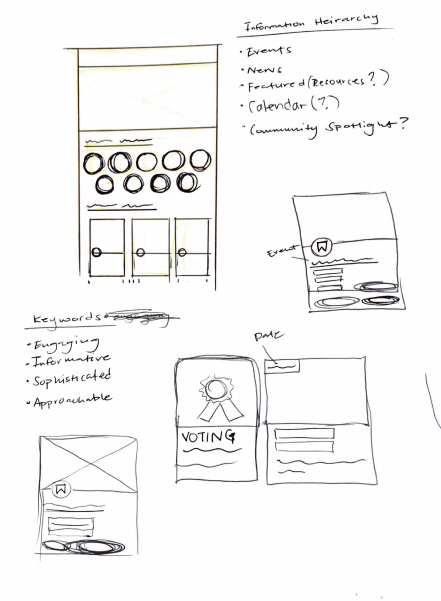
- Establish a Clear and Intuitive Informational Hierarchy by introducing a structure to alleviate issues of disorganization and confusion.
- Transform the Rochester City website to improve user-friendliness and visual appeal.
- Build a cohesive design system, with attractive branding and visuals to engage both visitors and residents.
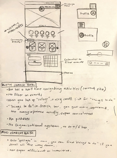
Problems Simplified
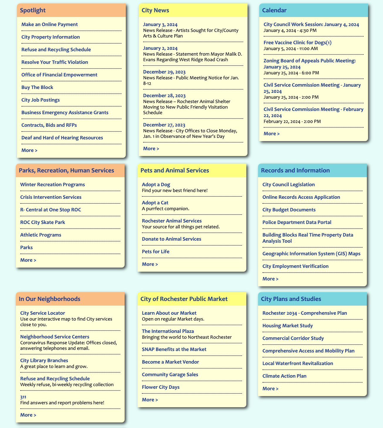
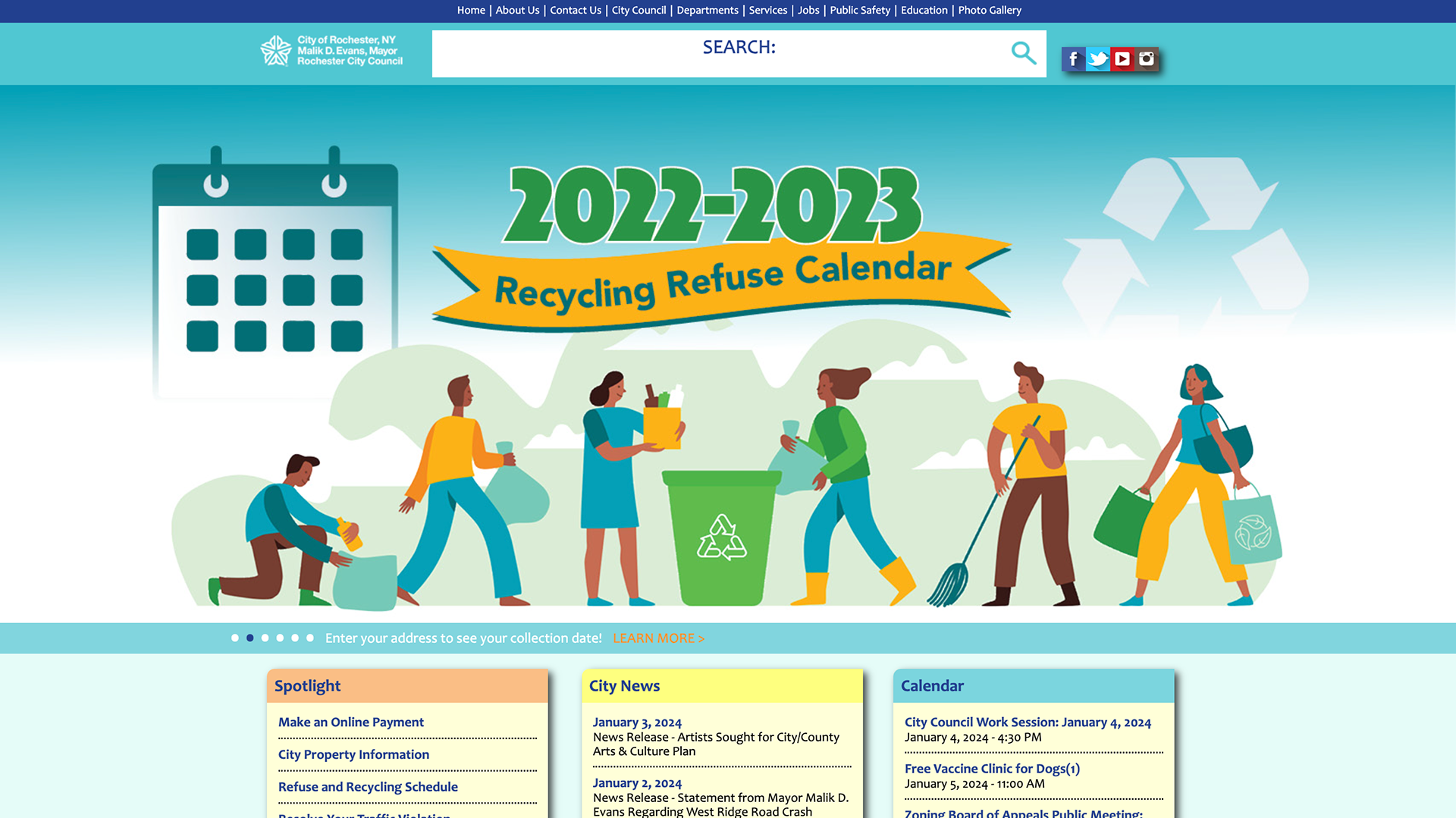

- Lack of Hierarchy: The absence of a clear hierarchy creates confusion and hampers information prioritization.
- Text Overload: Information overload is hindering user engagement. Streamlining content is key.
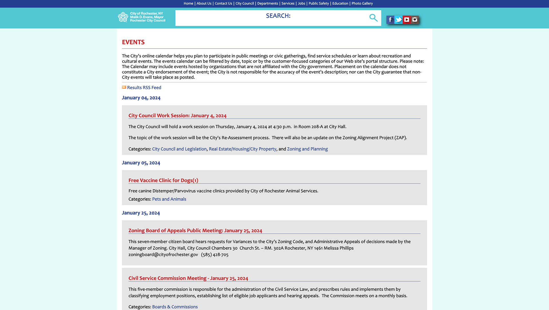
- Confusing Userflows: User flows are convoluted, impacting navigation and overall user experience.
- Ineffective Header Usage: Headers lack meaningful hierarchy beyond size and color, leading to a lack of content distinction. Colored tabs around headers provide no valuable differentiation between content types.
- Redundancy Issues: Information redundancy is prevalent, hindering intuitive navigation. Important information is also scattered, impacting user flow and information retrieval.
- Text Overload: Information overload is hindering user engagement. Streamlining content is key.
- Confusing Userflows: User flows are convoluted, impacting navigation and overall user experience.
- Ineffective Header Usage: Headers lack meaningful hierarchy beyond size and color, leading to a lack of content distinction. Colored tabs around headers provide no valuable differentiation between content types.
- Redundancy Issues: Information redundancy is prevalent, hindering intuitive navigation. Important information is also scattered, impacting user flow and information retrieval.
Comparative Analysis
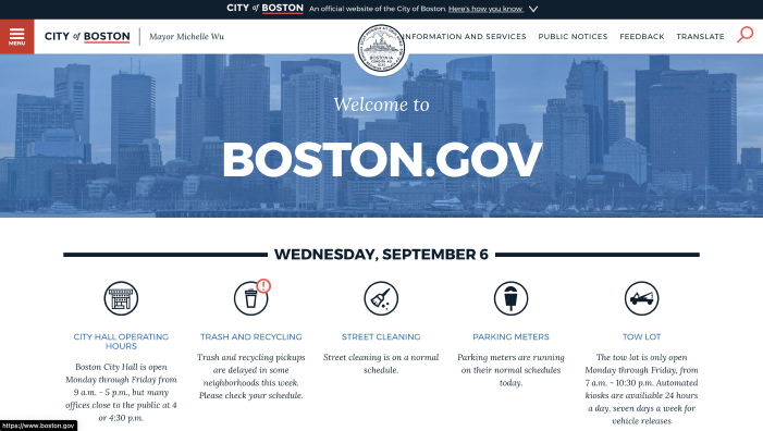
Boston.gov has a great website layout that I would like to replicate somewhat. I enjoy the simple graphics to display information. I especially like how the logo breaks the hero image a bit and adds a sense of depth. The condensed hamburger menu cleans up a lot of the space and declutters the navigation. Additionally, the featured resources, although different amounts of information, follow a similar grid pattern that balances out the varying information.
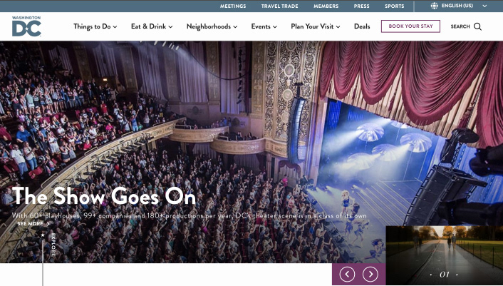
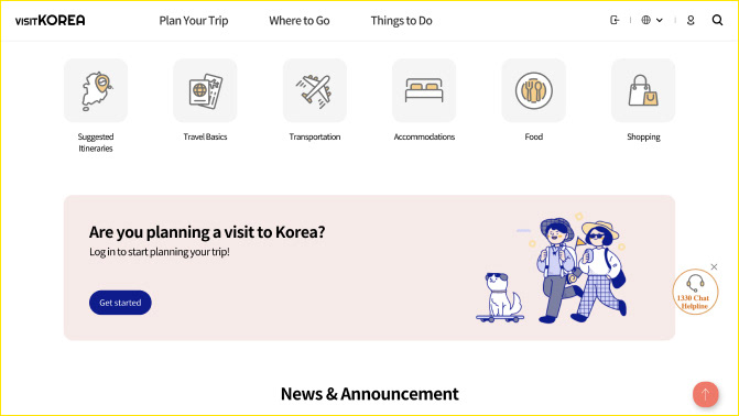
Washington’s website has a very minimal but effective navigation. I may implement the “Things to Do” tab because it can break down a variety of activities into small groups for better filtering.
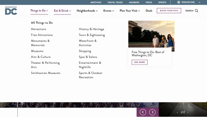
I like how there are subcategories like “Attractions” and “Free Attractions”, so that people, especially college students, know what they’re looking for. I think incorporating more subcategories, but not adding too many so that students can still find what they need, would be very effective.
I like how there are subcategories like “Attractions” and “Free Attractions”, so that people, especially college students, know what they’re looking for. I think incorporating more subcategories, but not adding too many so that students can still find what they need, would be very effective.
Pattern Collecting
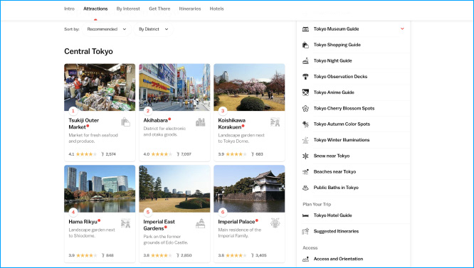
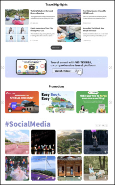
I searched "abroad" for pattern collecting, looking at tourism sites for Japan and South Korea and their use of UI cards. These sites displayed clean graphics, simple designs, and nice alignment. Treating the webpage as more of a social media platform seemed interesting, stemming from these designs. I saw that the sites showed off travel destinations by highlighting them with amazing photos and focusing on great visuals accompanied by minimal information.
Experimental Designs
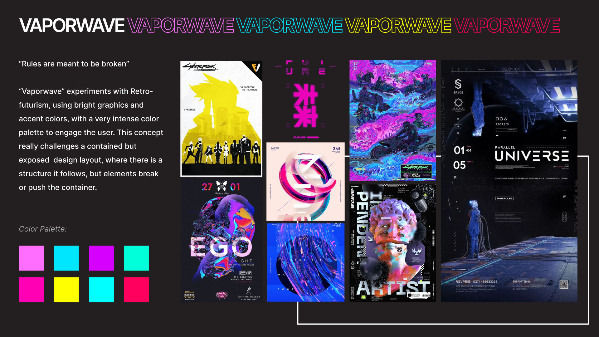
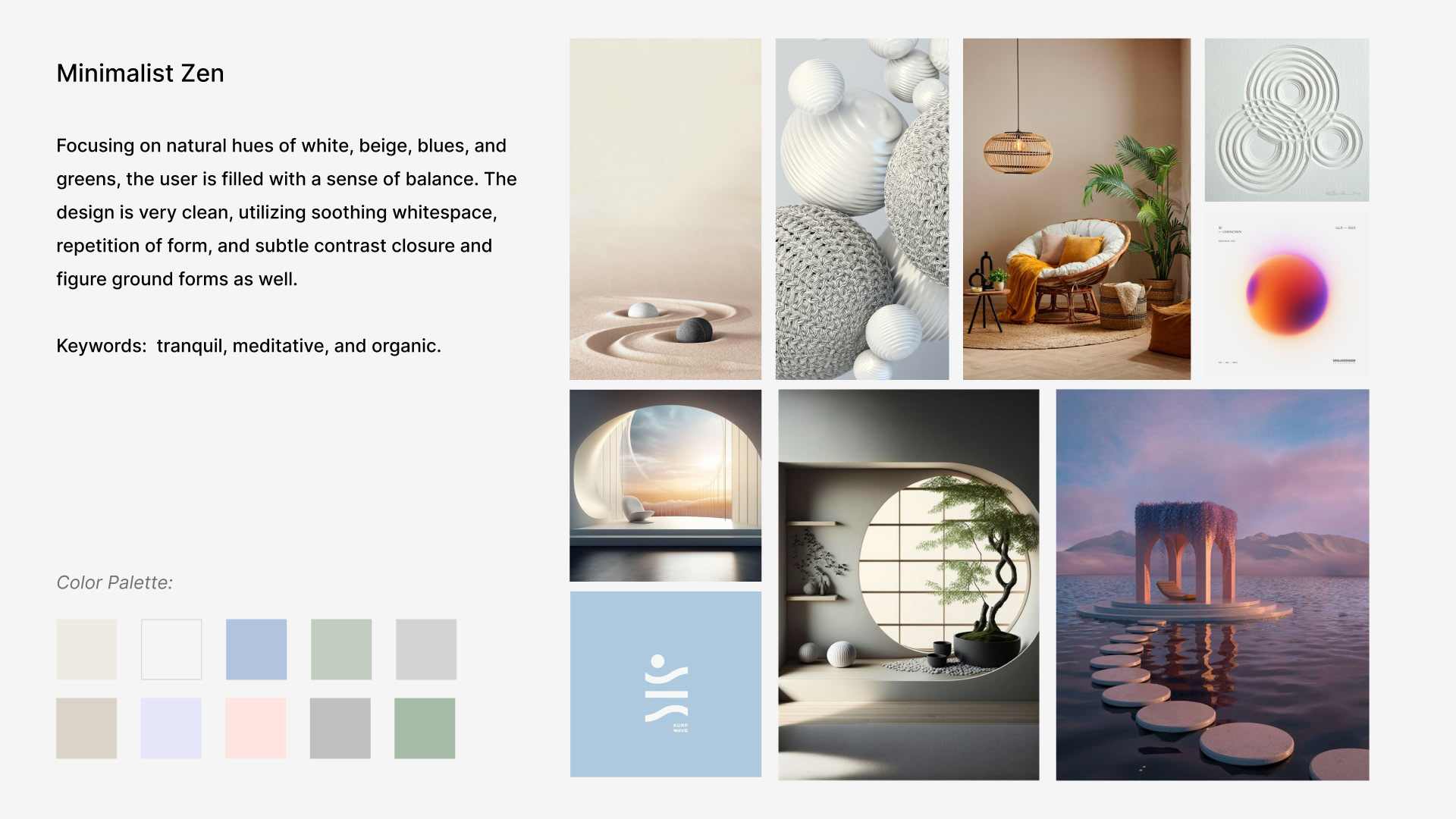
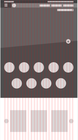
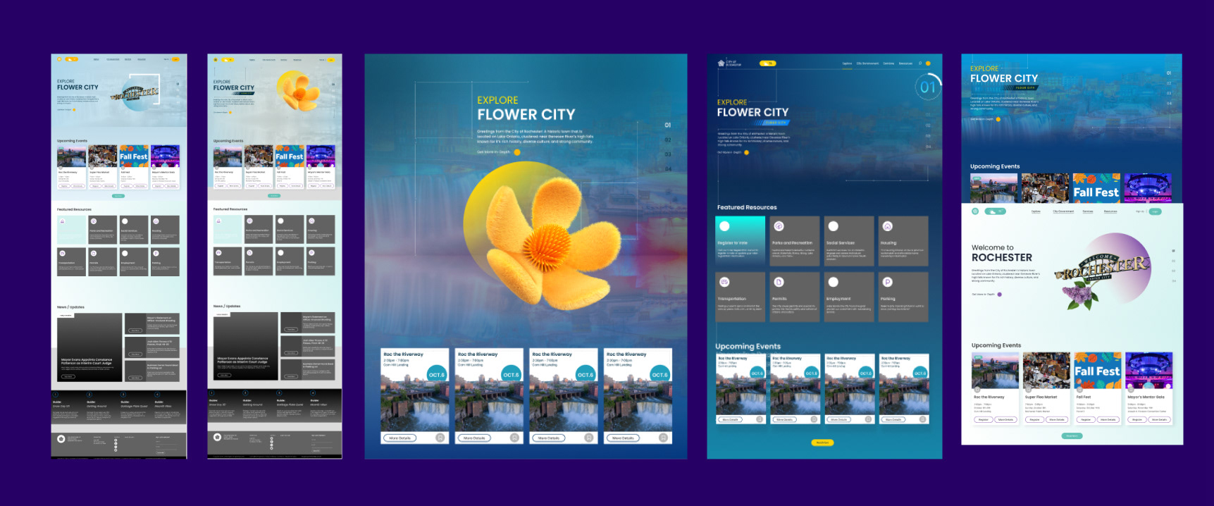
Before designing the wireframes and high-fidelity mockups, I wanted a better sense of direction for this project. I created two designs that were almost complete opposites, experimenting with color, shape, structure, grids, etc. The two designs I implemented were Vaporwave and Minimalist Zen. Vaporwave experimented with having UI elements that essentially break the grid, whereas Minimalist Zen focuses on utilizing whitespace to add a sense of sophistication while not overwhelming the user.
After I had created my mood boards, I took what was working for both designs and attempted to combine the two:
Vaporwave
- Bold colors and bold type.
- The grid in the back over the low-opacity image gives a sense of texture and complexity.
- The vertical scroll carousel; is a fun way to engage the user.
- High contrast between the hero image and the background color.
- Although there is text everywhere, there is a sense of balance, especially with a “visible” grid.
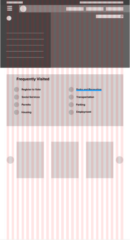
Minimalist Zen
- Utilizing white space that is very inviting to the user and doesn’t overwhelm them.
- Simple gradient in the back to add depth to the hero and the site.
- Divs and rounded buttons to introduce information like the login button.
- rounded corners that are easier for the viewer visually.
- The hero image doesn’t need to take up the width, or rather, the point of focus can be smaller than the whole hero section.
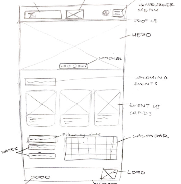
Sketches & Wireframes
Design Iterations
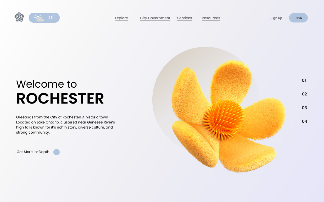
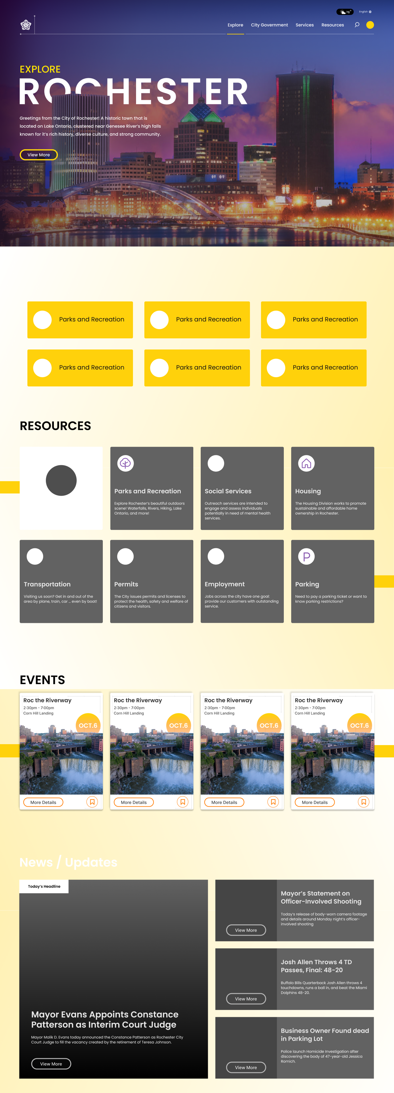
The challenge of merging two distinct mood boards was indeed daunting. Balancing complex gradients, strategically incorporating whitespace, and seamlessly integrating visually engaging photos while maintaining a clear visual hierarchy presented a considerable struggle. At a crossroads, I opted for a slightly different direction, a decision I'm now grateful for. This shift allowed for a more harmonious synthesis, successfully navigating the intricate interplay of elements that initially seemed incompatible.
Further Experimentation
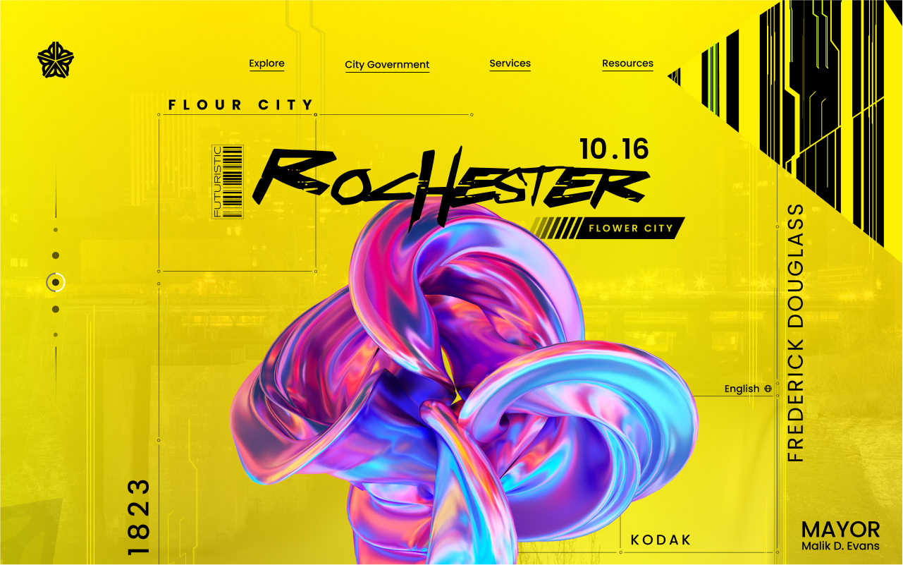
I realized that I was tiptoeing around a very bold design, and needed to lean into that more. However, I discovered that there were subtle design choices I could make that would add to this very bold design. In the examples below, I went with colors that highlight the city skyline, along with a purple and yellow color palette that would highlight the city more while adding excitement to the design.
Final Designs
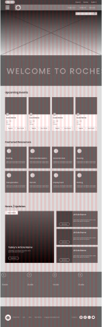
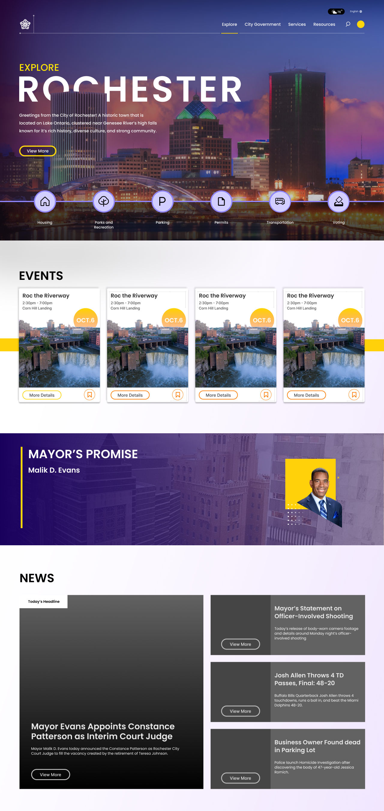
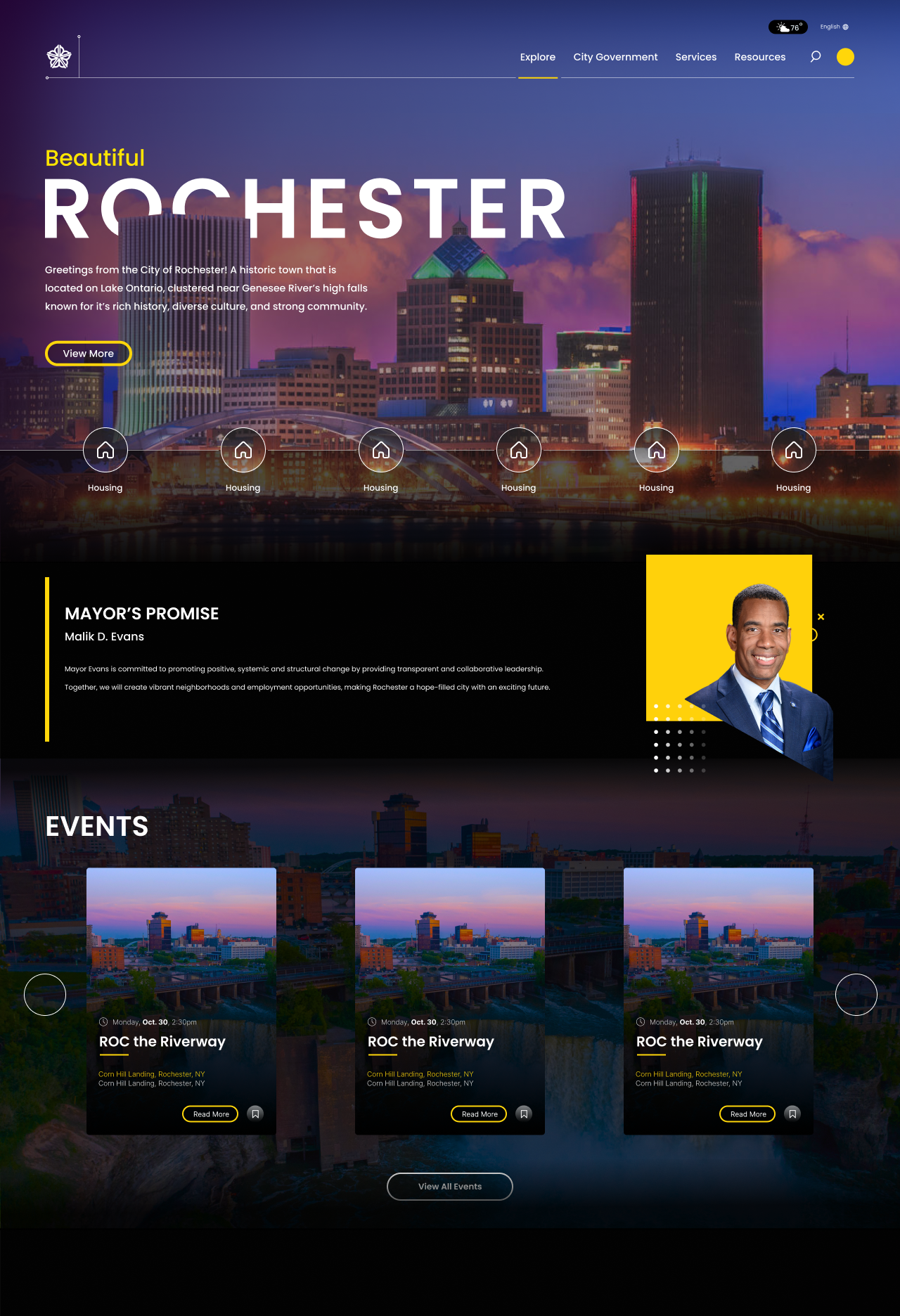
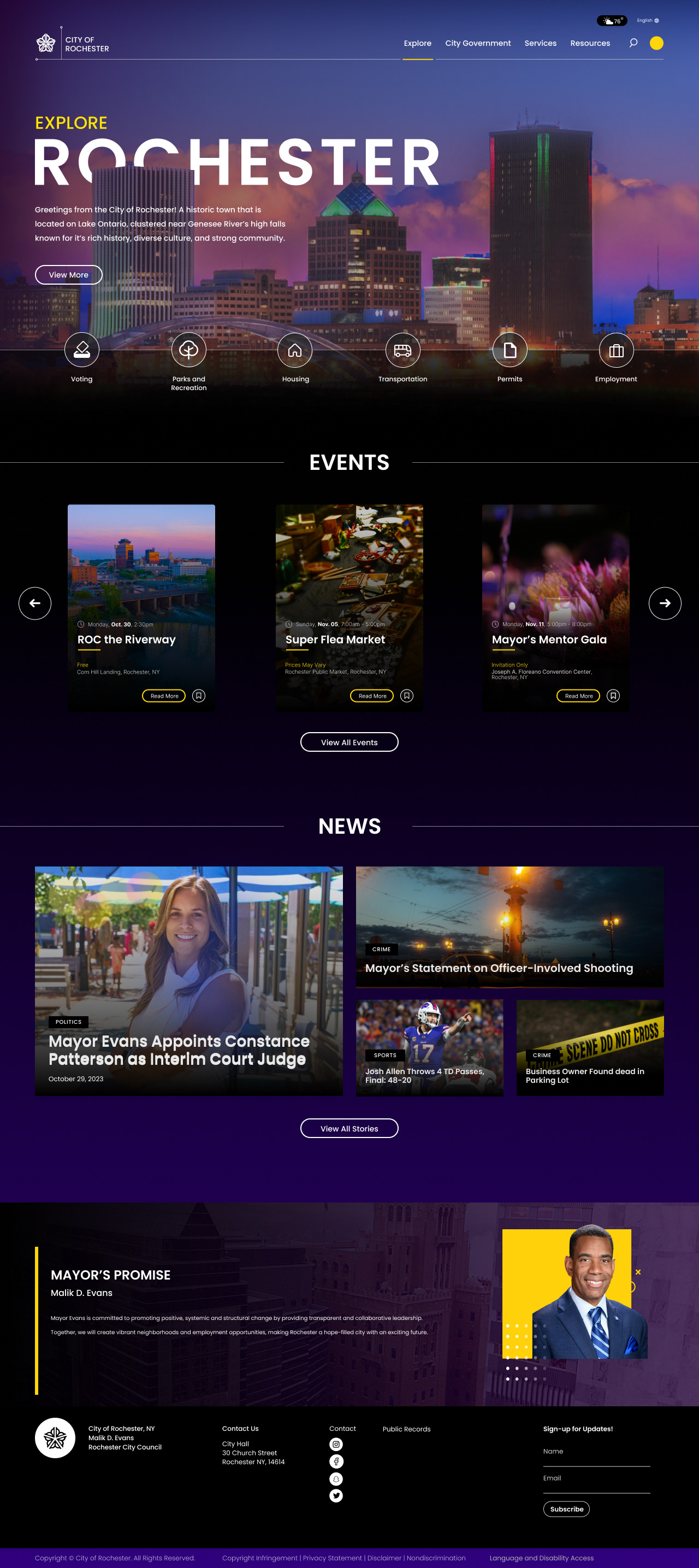
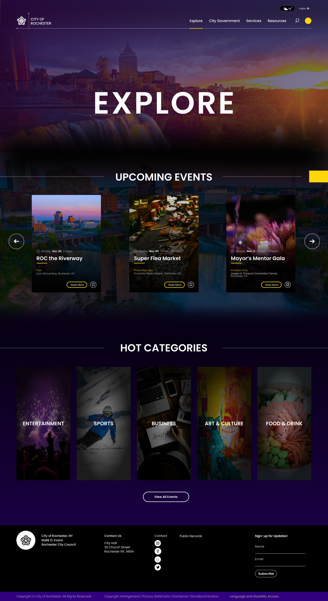
With the final Design, I decided to go in a bold direction, diving into this sophisticated design as the final design. Throughout the entire site is a dark gradient ranging from black to dark purple, and utilizes gradients throughout UI elements to add to the very subtle and elegant design. It encapsulates the sophistication that young adult audiences like college students yearn for, and the nightlife that a large demographic of the city, college students, are looking for.
You’ll see in the Explore page that it follows a very similar design layout to the homepage, and uses a lot more photos behind UI elements to show off Rochester in a cool way.
Figma Prototype
Takeaways
This project proved to be both enduring and challenging, yet immensely rewarding as it expanded my understanding of the UX process and problem-solving beyond individual needs.
The experience was truly remarkable, especially having the opportunity to engage with the city council on an actively improving issue, validating the dedication invested in the process. This period also served as an experimental phase, pushing boundaries in design styles and seeking inspiration from unexpected sources.
The ultimate satisfaction lies in the final product. Introducing a much-needed visual hierarchy to the Rochester City Website, I streamlined the user flow for events, transforming a once cumbersome experience into a seamless journey. The redesign not only simplifies navigation but also infuses the platform with visually appealing aesthetics, adding a vibrant personality that resonates with both visitors and locals, bringing the site to life.


